
Imagine a beautiful mountain vista. The sky explodes with colour. The scene is breathtaking. You hit the shutter and capture the shot. But when you see the image on the computer back home the photo looks…well, wrong. Maybe there’s a strange blue cast. Perhaps the colours seem dull and lifeless. Bad colour can ruin the best landscape shot. This is where colour correction and white balance saves the day!
Understanding Colour Temperature
To understand white balance it is important to first understand colour temperature. Colour temperature describes the colour of light. When we take a photograph, the primary goal in most cases is to record colours as neutrally as possible. This is where white balance comes in, allowing us to adjust our settings in-camera to achieve that neutral colour balance.
The Kelvin Scale: A Landscape Photographer’s Guide
The scale to measure colour temperature uses units called Kelvins (K). Low Kelvin values mean warm colours. Think reds and oranges. High Kelvin values mean cool colours. Those are blues and cyans. Candlelight is around 1850K, really warm in terms of colour temperature. Daylight is about 5600K, which is much more neutral. Shade can go up to 7000-8000K, making it cool. Use this guide to understand light better:
| Light Source | Kelvin Value (Approximate) |
|---|---|
| Candlelight | 1850K |
| Sunrise/Sunset | 2000K – 3000K |
| Tungsten Bulb | 2700K – 3000K |
| Halogen Bulb | 3000K |
| Daylight | 5000K – 6500K |
| Flash | 5500K |
| Cloudy Sky | 6500K – 7500K |
| Shade | 7000K – 9000K |
| Blue Sky | 10000K + |
White balance balances the colour temperature in your photograph by adding the opposite colour to those in the image to bring the colour temperature back to neutral. A neutral colour temperature has a reading of between 5000-6500K.
Colour Temperature and Landscape Photography: Creative Choices
Colour temperature isn’t just technical. It can be used creatively for setting mood within your images! A warm colour temperature makes cozy sunsets. Cool colours can evoke a chilly feeling.
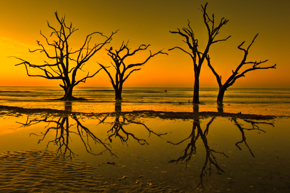
Think of two photos. One shows a sunset with golden light. This radiates warmth and happiness. The other shows a snow-capped peak. The scene is blue and serious. Both are good. But use temperature to tell a story.
Demystifying White Balance
White balance helps create true colours –
- It fixes colour issues.
- It makes whites look white.
- It gets rid of those weird colour casts.
It’s a critical tool in your photography toolbox.
White Balance Modes: Your Camera’s Colour Correction Toolkit
Most modern cameras offer white balance presets. Settings of Auto, Daylight, Cloudy, Shade, Tungsten, Fluorescent, and Flash are common.
- Auto: The camera guesses. Good in many cases.
- Daylight: For sunlight, not cloudy days.
- Cloudy: Warms up the image on overcast days.
- Shade: Adds warmth in shady areas.
- Tungsten: Cools down photos under indoor lights.
- Fluorescent: Fixes the green tint from fluorescent bulbs.
- Flash: For when you use flash, but not usually for landscapes.
Each mode has its pros and cons. Auto is easy. Presets are faster. For example, a landscape photo taken under a cloudy sky with “Daylight” white balance can look blue. Switching to “Cloudy” warms the image up. The colours look more real. Try them. See what looks best.
Custom White Balance: Achieving Perfect Colour Accuracy
Want ultimate control? Use custom white balance.
- Place a grey card in your scene.
- Tell your camera to read the grey card.
- Your camera will create a custom profile.
This profile will nail the colours. It’s ideal for important shots.
The Impact of Light on Colour
Light is everything in photography. Different light changes colours. Understand light. Improve photos.
Golden Hour: The Landscape Photographer’s Best Friend
Golden hour is the time after sunrise and before sunset. The light is warm and soft.
Golden hour light enhances colours and textures. It gives a magical feel. Shadows are long and soft.
Think about landscapes during golden hour. The warm light makes nature glow. The shadows create depth. It elevates the picture.
Dealing with Harsh Midday Light
Midday light is tough. It’s bright and direct. This harsh light washes out colours.
- Use a polarizing filter. It reduces glare. It boosts colour.
- Wait for clouds. They diffuse the light.
- Shoot in shade.
These tips can save your photos when the sun is high.
Colour Correction in Post-Processing
Post-processing is key. You can fine-tunes colour and white balance, fix small problems and enhance the overall look of your image. Remember to shoot in RAW to give you more scope to adjust images without degrading the image too much.
Using White Balance and Tint Sliders: Precision Adjustments
Most post processing software will have white balance sliders. The Temp slider adjusts warmth. The Tint slider fixes any colour cast such as green or magenta.
Tweak the sliders slightly. Overdoing it looks unnatural. Look for true colours.
HSL/Colour Panel: Targeted Colour Control
The HSL/Color panel lets you adjust individual colors. HSL stands for Hue, Saturation, and Luminance.
- Hue: Changes the color itself (e.g., blue to cyan).
- Saturation: Adjusts the intensity of the color.
- Luminance: Changes the brightness of the color.
For example, boost the blue saturation in the sky. Make green foliage more vibrant. But use it with care. Overdoing it will create unnatural looking images.
Advanced Colour Correction Techniques
Those with more experience of post processing can try advanced techniques. These add a personal touch to images.
Colour Grading: Creating a Unique Visual Style
Colour grading creates a mood. It makes your photos special. It’s more than just fixing colours. It’s about style.
Some like a cinematic look. This style uses blues and oranges. Others prefer vintage styles. These might use muted colours. A desaturated look can create a somber mood.
Using Colour Calibration Tools: Achieving Consistent Results
Colour calibration tools keep colours accurate and consistent. They ensure your monitor shows true colours. This is key for creating the best possible images. A good quality, calibrated screen means accurate edits.
Conclusion
Colour correction and white balance are important to understand. They help you get the right settings to capture stunning landscapes. Learn colour temperature. Master white balance modes. Adjust colours in post-processing. Practice to create your own style. A few simple steps will help you to create something truly stunning!
A Selection Of Guide Articles
Adapting A Vehicle For Landscape Photography
We talk about the thought process and steps we took to make life easier when adapting a vehicle for landscape photography
RAW Format Photography
Understanding Camera RAW format files and why they are best for photographers wanting optimal image quality and processing flexibility
Mastering Exposure
Mastering exposure requires understanding of the three principal mechanisms: shutter speed, aperture size, and the photographic material's level of sensitivity to light (ISO)
Essential Filters for Landscape Photography
Read about the essential filters for landscape photography to make your life easier and take your images to the next level
How To Photograph Winter Landscapes
How to photograph winter landscapes, gear, what you need to consider and understanding the how snow affects light
Planning A Photography Roadtrip
A guide to planning a photography roadtrip. How to find locations, what to pack and tips to get the most from your trip
Create Dramatic Landscape Photos
Luck, light, skill and perseverance are just some of the facets needed to create dramatic landscape photos
Landscape Photography: Portrait vs. Landscape Orientation
Comparing composition techniques and when to use landscape versus portrait orientation